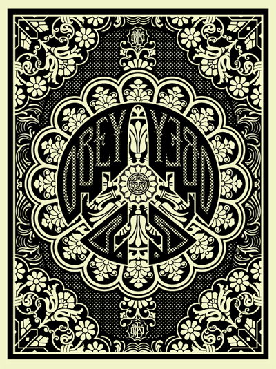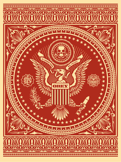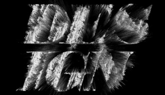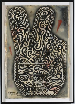
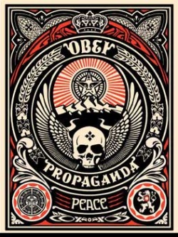
Everybody is familiar with Shepard Fairey’s work. His famous OBEY sticker campaign as well as the HOPE Obama Poster are two of his major achievements.
As he mentions in 1990 “The OBEY sticker attempts to stimulate curiosity and bring people to question both the sticker and their relationship with their surroundings. Because people are not used to seeing advertisements or propaganda for which the product or motive is not obvious, frequent and novel encounters with the sticker provoke thought and possible frustration, nevertheless revitalizing the viewer’s perception and attention to detail. The sticker has no meaning but exists only to cause people to react, to contemplate and search for meaning in the sticker. Because OBEY has no actual meaning, the various reactions and interpretations of those who view it reflect their personality and the nature of their sensibilities”.
As he mentions in 1990 “The OBEY sticker attempts to stimulate curiosity and bring people to question both the sticker and their relationship with their surroundings. Because people are not used to seeing advertisements or propaganda for which the product or motive is not obvious, frequent and novel encounters with the sticker provoke thought and possible frustration, nevertheless revitalizing the viewer’s perception and attention to detail. The sticker has no meaning but exists only to cause people to react, to contemplate and search for meaning in the sticker. Because OBEY has no actual meaning, the various reactions and interpretations of those who view it reflect their personality and the nature of their sensibilities”.
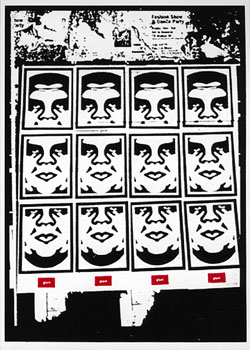
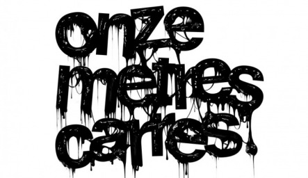
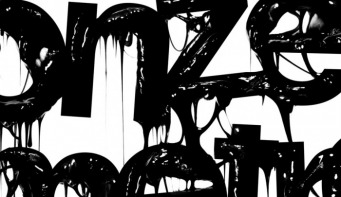
What I love about his work is the draftsmanship of his forms and textures. Striking visuals that dare you to look in order to convey a very clear and strong message.